Showing posts with label Photoshop. Show all posts

Thursday, February 24, 2011

Emily's twenty-second birthday card

Our daughter Emily had her twenty-second birthday this week, and unlike last year, when she turned twenty-one and we had the pleasure of her company here at home, this year she was celebrating with her friends and co-workers in California. I'm pretty sure she had a good time.

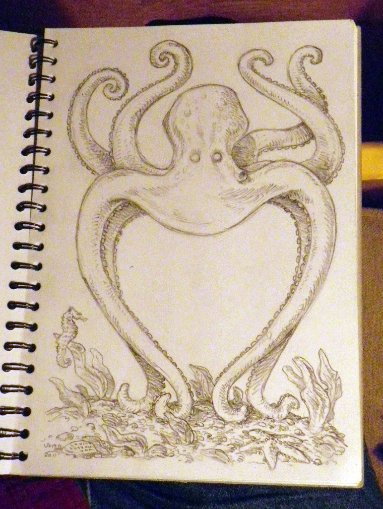
I have tried to make a birthday card for her every year, and I thought that this year I would continue the octopus theme which ran through our 2010 Christmas card and the Valentine's card I made for my wife this month. So I got out the sketchbook, and drew this:


It took a couple of days to finish -- I was at first not too certain that this was the way in which I wanted to go, so I left it lightly penciled and came back to it the following day, and decided that I liked it more. So I penciled some more on it, and decided that it was ready to ink.

Using my trusty number 06 Sakura Pgima Sensei marker pen, I got to work, and by the next day, had gotten it to this state:


I knew I wanted to watercolor it, so the next step was to make some copies to work on, which I did down at Mirage. The coloring went pretty quickly, and this was how it looked:


I wanted to put a background in -- something to do with the ocean -- and decided to use a similar technique as my last two cards, only this time I decided to use an actual photograph, albeit one lightly filtered in Photoshop. I went through some of my recent photos and picked out one from my trip with Jeannine to Cape Cod last year. I liked the light on the water and the clouds, and after running it through one of Photoshop's filters (I'm pretty sure it was "Rough Pastels"), this was the result:


I selected the background of the watercolored image, pasted the ocean scene into it, and voila! I had Em's card. -- PL

Monday, February 14, 2011

Happy Valentine's Day!

Over the years, I have made a few hand-drawn Valentine's Day cards for my beloved wife, one of which I posted here some time back. This year I decided to continue the theme of our last Christmas card, and when I made that decision I almost instantly got the vision of what it should look like. So I got out my sketchbook and drew this:


I was originally planning to ink it, and then to watercolor the inked version, but for some reason I decided to try something a little different -- I would apply the watercolors over the pencils instead.

Or to be completely accurate, I would watercolor a COPY of the pencils. So down to Mirage Studios I went, to use the color copier there (it does pretty well with heavier paper stocks), and after some trial and error, had managed to get a pretty decent copy of the pencil drawing on a sheet of heavy card stock.

I got out my little watercolor set and after a few hours ended up with this:


I was pretty happy with the result, and -- because I am still not brave enough to try doing a background in watercolor -- I decided to go for a computer-aided background, like the Christmas card, with one difference. This time, I thought I would do a quick wash of some colors on a separate sheet, using the watercolors, and then scan that, and use it for the background that I would insert via Photoshop. This was the result, and it came out a little funky due to the way the paper buckled during the application of the watercolors. But it was okay.


While I like the result, I decided to mess around with it a little bit in Photoshop, adding a few different filter effects. This is the one I decided to use.


It was the work of a few more minutes to select the background areas of the octopus image and paste the filtered ocean background into it, and this was the result:


I am happy to report that Jeannine liked her card. -- PL

Sunday, January 23, 2011

"Monument", color version

Back on January 10, I posted this image (to which I have now given the title "Monument"), and said that "I may do a color version." Well, it took a couple of weeks, but for what it's worth, I made good on that threat, and here it is.


I have not yet gotten up the courage to try Stan Sakai's technique for doing backgrounds using the frisket film, so for this one I scanned the watercolored art and used Photoshop to drop in a background -- actually a filtered sky photo I took a few years ago. I like it all right, but I'm not totally happy with it -- I may go back and mess around with it some more. -- PL

Thursday, December 23, 2010

Blast from the Past #331: 2003 Christmas card

Jeannine and I got to talking a few days ago about our Christmas cards, and realized that we don't have an organized archive of all of them, which we both thought would be a neat thing to have. So I am going to try to put that together, which means starting with searching the hard drive on my desktop computer for any Christmas card-related files. So far, I have only come up with three -- not an auspicious beginning.

But one of them is something that before I started looking, I'd completely forgotten about. It's the card I made for us in 2003, and it was unusual in that unlike previous cards, this one was folded differently, in thirds in a kind of accordion fashion. That way, the image of the Turtle on the Segway was on the front of the card, and when unfolded you could see the whole image.


I kind of like this one... I think the colors work well. -- PL

Thursday, December 16, 2010

2010 Christmas card

When Jeannine and I shared our first Christmas in Dover, NH, I drew our first Christmas card, a tradition I kept up with for around ten years (I've posted one or two of them on this blog). As time went by, I moved from drawing the cards to creating them with various computer graphics programs like KPT Bryce and Photoshop. And for the last few years, I've just taken some wintry photos and tweaked them a little bit in Photoshop to make them more Christmas-y.

They were fine, and served as decent Christmas cards, but I felt then and now that something was lacking. There was something about actually drawing the card that brought me closer to the holiday somehow… and I'd lost that. I'm not completely sure why -- quite possibly it was in part due to laziness -- but in any case, this year I wanted things to be different. This year I wanted to go back to drawing our card.

And not only that, I wanted to try to recapture some of the -- well, let me be blunt and call it what it was -- wackiness of some of those cards from past years. I recall things like "The Christmas Snail", a drawing which depicted a slightly anthropomorphic Christmas tree riding a huge snail on a beach.

So after I told Jeannine of my intentions, and she enthusiastically approved, I started thinking… and within a few hours an idea came to me in the form of an image of an octopus standing on its head on the ocean floor, its tentacles twisted into a rough approximation of the triangular shape of a Christmas tree, and holding in those tentacles, at the very top of the "tree", a starfish.

I got to work and within a short time had sketched out the idea.


Over the course of the next few days, I inked it with a variety of black brush markers.


Around  this time, I asked Jeannine if she would be willing to write a poem to go along with the art, and to my delight, she agreed. So while she was musing about that and trying out different rhymes, I had to decide how to color the piece. I'd thought about doing the colors in Photoshop, but decided I wanted to keep more of a hand-drawn look (though I knew I would probably tweak the art in Photoshop). So I got out my new box of Pitt brush markers -- I think there are sixty-four different colors in it -- and got to work. This was the result.


I liked it okay, and Jeannine thought it was fine, but for some reason, I wasn't totally happy with it. I decided to try a second version, this time using watercolors over the black and white line art. (I think I was inspired in this not only by that Jerry Pinkney show I talked about a few blog posts back, but also by seeing some of the beautiful watercolor art Jim Lawson has been doing recently.)

I don't have a lot of skills in this medium, but I figured I should just jump in and try it. And it went more easily than I expected, and I liked the results.


Now I had to put a background into the image, and rather than try to carefully mask out the image and attempt to do a watercolor background, I decided to cheat a little bit and use my computer to create something that I could play around with until I got the look I was going for… and after a few tries, I was satisfied with this one.


By this time, Jeannine had finished her poem. I made a few suggestions, of which I think she may have used one, and she tweaked it a bit further. This is the version that ended up inside the card. (You may have to click on it to get a bigger, more readable version.)

(Here's the poem in plain text in case the above is too difficult to read -- it isn't the clearest font, though I like the shapes of the letters.)


"Some say reindeer can't fly to rooftops


and holidays don't happen in the seas.
They say the sky is up, the ocean down,
and octopi can't be Christmas trees.

But there's more than one side to a story
and more than one side to a tree. An octopus
can twinkle. And special stars can swim.

We wish you many merry days with fishy lyricism!"


And because I was a little concerned that my original idea (that of an octopus pretending to be a Christmas tree) might not come across as clearly as I wanted, and also because I wanted to make sure that Jeannine got her due credit for the poem, I put the following on the back of the card.
It took more work than the cards I've done these past few years, but I have to say that it was much more satisfying than all of those. And I believe it marks the first (though I hope not the last) time that Jeannine and I have really collaborated in a words-and-pictures fashion. -- PL

Monday, March 1, 2010

Interesting effect

A couple of weeks ago, I took this photo of some trees near the Mirage parking lot as the sun was setting and the sky was a lovely blue.


There are some bright security lights in the parking lot, and the way they lit up the trees and gave them extra contrast against the darkening sky was interesting.

A few days ago, I was playing around with this photo in Photoshop, and for some reason -- don't ask me why, as I can't remember -- I did the following:

-- Selected the image (Command-A)
-- Copied the image (Command-C)
-- Pasted the image (Command-V), which created a new layer
-- Chose "Overlay" as the option in the "Layers/Blending Mode" pop-up menu

... and this was the result:


I was immediately struck by the apparent 3D effect that was created. It reminded me of images from those old "Viewmaster" discs for some reason. I don't know why this operation created this effect, but I must say I like it.-- PL

Friday, January 29, 2010

Icy waterfall

One of my favorite nature spots in this area is Chapel Falls, a series of small cascading waterfalls outside of Williamsburg, MA. It's a beautiful spot at all times of the year, but definitely takes on a kind of eerie, severe beauty in the winter, when the cold temperatures render the rushing waters into weird and wild ice forms.

I took some photos of the falls last January, and just ran across them this week. Here's a view of the largest of the falls, put together from two photos (with the help of PanoramaMaker, of course!).


I wanted to try to eliminate the overly blue cast to this other photo of the falls…


… so I opened it in Photoshop and ran one of my favorite quick "Adjustments" on it, "Auto Levels" (Command-Shift-L). I've had good luck with this in the past, but in this case it produced a somewhat bizarre and unexpected effect, as you can see here.


The "bloody falls" effect is creepy… but also kind of cool. I have no idea WHY it happened when I made that adjustment. -- PL

Thursday, November 19, 2009

Nice light through clouds from bike path in Hadley

A few weeks ago, I was pedaling back from Amherst on the bike path in the late afternoon, and stopped at a road crossing in Hadley to take a photo -- actually several photos -- of some clouds off to the west dramatically pierced with shafts of sunlight. I put them together into this partial panorama.


While the lighting in this image pretty much captures the scene as it was, and encapsulates that sense (at least for me) of too-early dusk and the feeling of approaching winter that one gets here in early to mid-November, I was also a bit disappointed that much of the landscape was rendered too darkly, obscuring a wealth of detail. So I decided to do a little "quick and dirty" Photoshop manipulation with a fast selection and use of the "Brightness/Contrast" image adjustment menu, which gave this result:


As I said, it's a "quick and dirty" effort, but it once again reminded me of what an incredible program Photoshop is... this effect took all of two minutes to accomplish. -- PL

Tuesday, February 24, 2009

Happy Birthday, Em!

A few years ago, I used Photoshop to put together the elements of this image as a card for my daughter's sixteenth birthday. I used the "official" photo taken of her in the hospital a day or so after she was born, and added two of her (then, at sixteen) favorite things -- Red Bull and a cell phone.


I don't think she drinks as much Red Bull any more, but the cell phone is definitely still a big deal (although she's gone through several since that one!).

We didn't get to see Em on her birthday this week (sob!), but she had fun taking her two roommates with her to Mardi Gras in New Orleans, to celebrate -- at least in part -- her fond farewell to her teenage years. Hard to believe my little girl is entering her third decade.

Love ya, Emmer! -- Dad