Showing posts with label illustration. Show all posts

Friday, March 16, 2012

Blast from the Past #497: "Copyrite" logo design

I can't remember exactly what this was all about, but I suspect it was something I did for a client of a small local design firm in Northampton, for whom I did some graphics and illustration work back in the late 1970's.


What I do remember about this one is having fun with it. I enjoy trying to develop logos, and this one in particular was fun because I liked using the three-dimensional pencil forms twisted in various ways to make the letters. -- PL

Saturday, July 16, 2011

Salley Mavor

I wanted to blog about this extraordinary artist -- someone whose work my wife turned me on to -- last December, after my friends Rick and Rob accompanied me to her "Pocketful of Posies" show (here's a not-so-great photo I took of the cover illustration for her "Pocketful of Posies" picture book):


… at the Danforth Museum in Framingham, MA and we were all just blown away by the quality of her work... but I couldn't.

Well, I guess I COULD have, but it might have ruined the surprise Christmas gift I managed to procure for Jeannine through an email contact with with the artist -- several of Salley's original three-dimensional illustrations. Here's a photo of one of them, from a series of works illustrating the nursery rhyme "Hey Diddle Diddle", I believe. (Photo by Salley Mavor.)


The cliche phrase "photos don't do these justice" was never more apropos than for the work of Salley Mavor. These things are simply amazing to look at, and benefit from standing in front of with your face a few inches away so that you can see more clearly all of the detailed stitching and nuanced color and careful design choices. Although it is completely reasonable -- for the sake of preservation -- that these pieces are behind glass (in beautiful wood frames made by Salley's husband Ron), it is also a shame, because if you are anything like me, you just want to TOUCH them, and tactilely experience Salley's amazing melange of textures. Her use of found objects is extremely clever -- in one piece, a baby is swinging in a cradle hung from a tree branch… and the cradle is a quarter of a walnut shell. Absolutely perfect!

I don't think the show at the Danforth is still up, but Salley has a new show -- a slightly smaller number of pieces, but also several new ones which were not in the Danforth show -- at the Brattleboro Museum and Art Center in Brattleboro, VT. The show is titled "Sewn Stories", and Jeannine and I were very happy to get an email invitation to the opening, which was last night. And it was even more fun because we got to meet and talk briefly with Salley (and Ron).

Here's a photo from the opening last night of Salley posing with one of her more recent pieces, a large and gorgeous one titled "Rabbitat".


I highly recommend checking out this show, as well as the books which Salley has illustrated. A good place to start is Salley's website:


 And you can go here:

http://blaine.org/sevenimpossiblethings/?p=2039

... for an excellent interview with Salley. -- PL

----------------------------------------------

SALLEY MAVOR: SEWN STORIES 
July 15, 2011–February 5, 2012

Textile artist and children’s book illustrator Salley Mavor’s original fabric reliefs are created from hand-dyed wool felt, embroidery thread, found objects, and manufactured trinkets and beads. Included in this exhibit are several works from Pocketful of Posies: A Treasury of Nursery Rhymes, which won the 2011 Boston Globe Book Award and the 2011 Golden Kite Award.

Saturday, April 23, 2011

Blast from the Past #361: Hobbit and dwarves and trolls

Last week, I was excited to watch Peter Jackson's first "video diary" from the set of the first of the two "Hobbit" movies that the "Lord of the Rings" director is finally shooting in New Zealand. I look forward to the finished films.

In honor of the beginning of the filming of this long-awaited adaptation of a beloved book, I dug up this old drawing -- I think it is from the late 1970's or early 1980's. I am not completely sure WHY I drew this, other than that I am a big fan of Tolkein's book.


I'm also not sure why I left it unfinished... seems to me like it's almost all there, and I would just need to put in some spot blacks and maybe a little shading.

In any event, fans of "The Hobbit" should be able to tell what scene this is meant to illustrate. -- PL

Monday, February 28, 2011

Blast from the Past #353: Illustrations for "Dan Gabriel Real Estate" ads

(I apologize in advance for the "sketchy" quality of these images -- when I photographed this art last year, I didn't light some of it properly. I tried to tweak it in Photoshop to get it to look good, but realized pretty quickly that it would take hours to do that, so I just decided to use them as is. -- PL)

Back when we were living in Dover, and the TMNT comic had yet to bring in enough money to allow me to focus on that and not worry about getting other illustration jobs to help pay the bills, I got a number of gigs doing stuff for local businesses. The Dan Gabriel Real Estate company had offices on one of the main streets in Dover, and as I recall, they were going through some kind of big change in their business -- I think they were becoming associated with Coldwell Banker, or moving to a new location, or both, or something like that. Anyway, they wanted to do a series of ads which would announce this change in an eye-catching way, and for some reason, they hired me. (I cannot at this point remember HOW I got the job -- did I approach them? Did they approach me? If it was the former, how did I know they needed some illustrations? Who knows? I wish I did.)

Anyway, this turned out to me a lot of fun to do. And I am pretty sure it was my idea to do the ads this way. The basic concept was this fanciful notion of elves carving the new offices of Dan Gabriel Real Estate out of one huge solid block of wood, and I drew four stages of this activity, starting with the block just slightly carved, and ending up with a fairly accurate rendition of what the Dan Gabriel office's facade looked like. (Unfortunately, I have not been able to find that last drawing.)
Here's the first one…


… the second…


… and the third.


I also drew some small images which were to be used as "teasers" to get people to wonder what was going on with these wacky little elves showing up in various spots in local newspapers.


And I did keep one tearsheet from a local paper -- the Rochester Free Press, I believe it was called -- in which the ads were run.


In my experience, it was rare to get a chance to draw something for a client like a real estate agency which had any kind of whimsical elements, and this one was just about ALL whimsical. -- PL

[10-18-14: UPDATE -- I've been reading some old letters that I wrote to my parents during the period when Jeannine and I lived in Dover, NH, and I discovered the reason why I got the gig doing the artwork above. Apparently, I had made a contact with Terry Dunn, the editor of the "Rochester Courier", the local newspaper in Rochester, NH, two towns away from Dover. I had forgotten that he had helped me connect with various local business who needed artwork for ads and such, providing me with much-needed opportunities to make some money. Thanks, Terry! -- PL]

Wednesday, February 23, 2011

Blast from the Past #352: John Morrison in a biplane

I can't remember exactly WHY I drew this, but I do seem to recall that it depicts -- in a somewhat unrealistic, cartoony way, of course -- an event in the life of local theater owner John Morrison. The details are, at this late date, pretty vague in my mind, but I think it had something to with his having to get on a small plane to bring a print of a certain movie to show in his independent movie house, the Pleasant Street Theater.


John actually gave me several of my best gigs as an illustrator back in the late 1970's and early 1980's. I got to do several posters for his theater, including my favorites, "They Came from the 50's!" and "Thrilling Hepburn Tales" (I'll have to dig that one out and post it sometime). The Pleasant Street Theater still exists in downtown Northampton, showing movies you usually can't get to see at the bigger cinemas. I am not sure if John is still associated with it.

One fun thing about this drawing that I realized as I was getting it ready to post here is that there are some Northampton-specific details in the background which are fairly close to reality. That's the Coolidge Bridge over the Connecticut River, and I even got Route 91 and the exit from it onto Route 9 in there, along with some of the buildings just over the bridge. (I somehow missed the railroad bridge -- which is now a key part of the bicycle path to Amherst -- that lies just north, almost within a stone's throw, of the Coolidge Bridge. D'oh!) -- PL

Tuesday, February 8, 2011

Blast from the Past #348: Fanzine drawing -- "Four-armed assassins"

This is another drawing I did for a fanzine in 1984, and I think it may have been meant to go with the other one I just posted recently. I say this because there is a tiny thread of memory drifting around in my head that links them, and because the inking styles are so similar, and also because the thing that one of the assassins is sculpting -- a mask, perhaps? -- looks suspiciously like it might be intended to replicate the look of one of "Star Trek"'s well-known alien species.


And that would be a Tellarite, first seen, I believe, in the "Journey to Babel" episode of the original "Star Trek" series (one of my favorite episodes, by the way). I could be wrong about the provenance of this drawing, but it feels right to me. -- PL

STAR TREK and related marks are trademarks of CBS Studios Inc.

Saturday, February 5, 2011

Blast from the Past #346: "Dragon with mushrooms" (black and white version)

Back in November of 2008, I posted this "Blast from the Past", number 120... and today I just came across my original black and white inked version.


I like this dragon's expression and its body language -- I think this may be my favorite of all the dragons I've drawn. -- PL

Wednesday, February 2, 2011

Blast from the Past #345: Fanzine drawing -- "Klingon shopping with Vulcan"

Just got in from about an hour and a half of snowblowing and shoveling (and a little bit of plowing) -- the big winter storm that was predicted DID in fact drop quite a bit of snow on us. Right now, it seems to have stopped, and I am hoping we don't get more today. I am definitely tired of New England winters.

Anyway, back to warmer pursuits -- like blogging.


This drawing is another one I did for some fanzine sometime in 1984, but that's about all I can remember. It is so specific in its details that I am almost certain it was drawn to accompany a piece of "Star Trek" fan fiction. -- PL

STAR TREK and related marks are trademarks of CBS Studios Inc.

Friday, January 28, 2011

Blast from the Past #343: Fantasy illustration

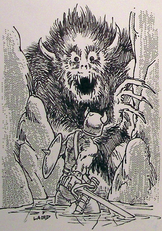
This is another one of those drawings from the early 1980's for which I cannot recall too many salient facts.


I am not even sure if it was drawn to be published, though the specificity of some of the details -- like the look of the monster -- leads me to believe it was a commission for a fanzine. -- PL

Monday, January 24, 2011

Blast from the Past #342: "Hampshire Life" garden chart cover, printed color version

Some years ago -- I can't remember if it was while we lived in Sharon, CT or when we moved back to the Northampton, MA area -- I decided that it would be a good idea to get more organized with the clippings of my published work. This was mostly the stuff I did for "Hampshire Life", with some other work mixed in.

So I made a folder. It measured about 15 inches by 20 inches, and I used cardboard cushioned with some kind of material the nature of which I cannot at this time recall, and covered it with fabric. I glued a somewhat fancy foil-type paper on the inside.

Then I took large sheets of some fairly heavy paper -- I think they came from a cheap sketchbook -- and proceeded to cut out, trim, and glue down all of the printed samples of my work that I had saved, ending up with about 80 pages like this. Then I stuck it in a cabinet and rarely looked at it. I think the last time I took it out was when Emily was somewhat younger and I was trying to show her what her Dad did before the Turtles took over his life. (As I recall, she wasn't that interested.)

Recently, though, I had call to pull it out again, when I was trying to find the image of Dr. Martin Luther King and Archie Bunker's stuffed chair for this blog post. I knew I had done that drawing, and I knew I had seen it recently. I thought that was when I was going through some of the photographs I'd take in my old studio last year when I started (but still have not finished) my "digital art archive" project… but I was wrong. I went through all those files and could not find the image. But I thought it was very likely that I had a printed version in my pasted-up clipping files, and so I did, and that's what I used for the blog post on MLK, Jr. day.

(Curiously, two days later I found the original for the drawing sitting on top of a pile of stuff in my very messy room… I guess that's where I'd seen it recently and then forgotten about it.)

Anyway, when I went into that old folder to look for the Dr. King drawing, I was pleasant surprised to see that at least for some of the pages, I had actually taken the time to write down next to each piece where and when it had been printed. And as I went through the folder, I saw quite a few things I'd forgotten I'd drawn.

A few days ago, I spent a couple of hours taking photos of each of these pages. It is not the greatest quality for a digital archive, but it's something. And the way these clippings are yellowing (they were almost all printed on newsprint), I think it is better to have even a low-quality set of images of this stuff than let it go to the point where they will have changed so much that it would require huge efforts in Photoshop to bring them back to a reasonable facsimile of how they originally looked.

So now that I have this new group of images, I may be pulling stuff out for this blog, and if they look a little funky, that will most likely be because of the aforementioned process of slow decay of the medium on which they were printed. But it's kind of fun to look back and see how some of these things were actually printed -- I'd forgotten some stuff, especially with covers I did for "Hampshire Life", where someone in their in-house art department would add mechanically-separated colors to the art. I never had a hand in this, and I think for the most part whoever did the colors did it well.

One of my favorite "Hampshire Life" covers was the "garden chart", which I have already posted in its black and white form here. And now, the art as it appeared when printed.


-- PL

Thursday, January 20, 2011

Blast from the Past #339: fanzine drawing

I am pretty sure this was drawn in the early 1980's, very likely for one of the fantasy fanzines I occasionally did stuff for. It's interesting for me to look at now because it may be the ONLY existing example of my work using a shading technique I experimented with back then.


It was a derivative of presstype -- you know, those sheets of letters which you could lay down over a layout and rub with some kind of burnishing tool to transfer the letter you chose to the surface you were working on. Hmmm... does anyone still use that stuff? What with the ubiquity of computers and graphics programs which make doing text a breeze, it may be that presstype has gone the way of the dodo. Maybe not -- I just haven't seen any in stores lately. (Of course, I haven't been LOOKING for it, either.)

Anyway, this stuff used the same technology as presstype, only instead of letters or numbers, it had tones. In this case, it was a middle-range grey tone made up of dots. As you can see, I used it to give some tonal value to the rocks in the drawing.

As I recall, it was fun to try, but I quickly realized that it wasn't for me -- and if memory serves, one of the reasons for that was its cost. I think it was more expensive than the shading films I used at the time. In any event, I think this was the only time I used it for an illustration job. -- PL

Monday, January 17, 2011

Blast from the Past #337: Martin Luther King, Jr. ... and Archie Bunker's chair?

In honor of the great man for whom today's holiday is named, I dug out -- not without some difficulty -- this drawing I remembered that I had done years ago for the Daily Hampshire Gazette. It ran on the editorial page of the paper (NOT in "Hampshire Life", as I'd thought while I was searching for it) on January 16, 1980.


Unfortunately, although I had made a note about when and where the drawing was published, I did not save the editorial. But my somewhat sketchy memory tells me that it had something to do with both the discussions of the then-possibility of a "Martin Luther King, Jr. Day" and the installation of Archie Bunker's stuffed chair in the Smithsonian Institution. (Archie Bunker, as people of a certain age will recall, was the "lovable bigot" played by Carroll O'Connor in the tv series "All in the Family".)

And in the "You learn something new every day" department -- did you know that Martin Luther King, Jr.'s original name was Michael King, Jr.? I didn't, until I saw it mentioned online today. -- PL

Friday, January 14, 2011

Blast from the Past #336: Design for "Press Run" road race t-shirt

This is another one of those "I can't remember the details of how I got the job, but I remember the drawing" drawings. And this is one I've always particularly liked -- I think because it was one of those times that the drawing just WORKED, and turned out exactly the way I wanted it. (Whether or not it turned out the way the CLIENT wanted it, well, that's another story... though my admittedly shaky memory on this issue is that they liked it, too.) The "Press Run" referred to in the design (in that hand-lettering which must have taken me laborious hours to do, and which could now be done -- and done better! -- in minutes using Adobe Illustrator) was, I believe, a local race sponsored by the Rochester Courier newspaper in Rochester, NH, which was just north of Dover.

Here's the front of the shirt...


... and here's the back.


Please excuse the slightly rough images -- I had to clean up the badly-lit photograph of this art, and it didn't work perfectly, I'm afraid.

I have done a few of these "front and back view" pieces before, and this is probably my favorite.

And looking at this art again as I proof this entry, and noting the date of the race, I realize it is altogether possible -- in fact highly probable -- that I drew this thing shortly before Jeannine and I got married in our little back yard in Dover. Maybe what I made from this gig was enough to pay for our wedding rings. (They weren't too fancy or expensive -- simple thin gold bands bought at a local "Service Merchandise" store -- but to me, they are priceless.) -- PL

Tuesday, January 11, 2011

Blast from the Past #335: Artwork for Spitfire simulator

This is a true blast from the past -- from my own past as an illustrator and from the dark, primitive past of computer graphics and software. It is also one of only a handful of illustrations I ever did with an airbrush -- I never had great skills with it, though I greatly admired people who did.


As I recall, I got this job through a local independent advertising agency whose offices were in a house on Bridge Street in Northampton, thankfully not too far form downtown, so I could ride my bicycle or walk there. The woman who ran the agency gave me this job quite possibly not knowing that I was not that great with the airbrush... or maybe I was good enough for this job in her eyes -- I don't know.

But I do remember that this one was hard to do, and taxed my frisket-cutting skills to the max. I think I had some photo reference or maybe even a model to use to get the rear perspective on the Spitfire airplane. The art was used in advertisements for the Spitfire flight simulator software.

It's interesting to see what passed for "state of the art" in consumer computer graphics back then (this was sometime in the late 1970's or early 1980's). I wonder if that company survived and went on to do bigger things? I have no idea. -- PL

UPDATE 4:46PM 01-11-11: Thanks to commenters FF and Adam Riches, I now know more about this game than I did when I did posted this blog entry this morning... including the fact that, as you can see from this image I plucked from eBay (via the link Adam supplied)...


...the artwork I did was used not only in advertising for the game but on the game's owner's manual as well. Thanks, dudes! -- PL

Monday, January 10, 2011

Finished!

I posted the unfinished version of this drawing back on November 29, 2010... and just five minutes ago I finished it... finished inking it, anyway. I may do a color version.

One of the reasons it had remained uncompleted for that long was that I had not penciled it fully enough when I'd started inking it. As I was explaining it to Jeannine this morning as we sat in the sunroom, she writing, me drawing, there are times when I can do a REALLY rough, loose sketch, and feel confident that even with those barest of bones to build on, I can grab an inking tool and go to work.

But then there are other times, like with the sketch that this started out as, where that confidence is not totally there, and the inking is hesitant and uncertain. It's usually because although the concept of the piece might be firm in my mind, the actual shapes and shades aren't. In all honesty, I'm still not sure this one came out as I originally wanted it to, but that being said, I do like it, and consider it done (at least for the black and white version). PL

Sunday, January 9, 2011

Blast from the Past #334: Superhero idea for "Big Y" advertisements

As you may know if you've followed this blog long enough, early in my illustration career I was fortunate to get several illustrating jobs for a local chain of supermarkets called "Big Y". As I remember, the work wasn't terribly interesting (drawing platters of fruit or cheese or cold meats), but it paid pretty well.

I'm not sure why I did the following conceptual drawing back in 1981 -- I doubt I was asked to do it -- but perhaps I had developed enough of a relationship with my contact at Big Y to feel comfortable making this kind of suggestion. And it was a true comic book geek-type suggestion: Use a superhero to sell groceries!


Yeah.

As you might expect, it didn't go over that well. Too bad -- it might have been fun to work on a campaign like that. -- PL

Saturday, January 8, 2011

Blast from the Past #333: Cover art for Smith College Alumni magazine

I think this one was drawn in the late 1970's… possibly 1980 or 1981. It was a job I got through a woman I'd met while she was working at the Daily Hampshire Gazette, and when she moved over to Smith College to be the editor (I think) of their alumni magazine, she remembered me and hired me to do a few gigs for the alumni magazine. Several of the drawings were pretty straightforward, illustrating various stories or articles in the magazine. I only got one job doing a cover for the magazine, and this was it.


And it was kind of odd, especially for a publication from Smith College -- a spectral woman walking through an ivy-covered brick wall. I know that I drew this to symbolize something in the magazine, perhaps the theme of that particular issue -- I don't recall. I do remember that it was fun to draw.

Here's the (very rough) rough drawing I did for the piece.


I have a vague -- and quite possibly flawed -- memory that the woman who gave me the job was shortly thereafter let go from that position, and I always felt a little guilty that maybe this slightly strange drawing had something to do with it. If I am remembering correctly, and that did indeed happen… I'm sorry! -- PL

Thursday, January 6, 2011

Blast from the Past #332: Drawing for Artisan Outlet Market Square Day 10K Road Race

Sometimes these days, when I am going through some old stuff looking for something interesting to post, I come across something that I sort of remember drawing… but that's about it. I don't remember exactly WHY, or WHEN, or WHERE, or for WHOM… but the drawing was clearly done by me, and clearly done for SOME reason.

So it is with this piece, with the integral "Artisan Outlet Market Square Day 10K Road Race" logo. I drew it in 1984, and I am pretty certain that it was while we were living in Dover, NH. To add to that certainty, I did a Google search for "Market Square Day" and Portsmouth (because I also had a vague memory of a Portsmouth, NH connection) and, sure enough, I got 37,800 hits. I only looked at a few of the results on the first page, but apparently there is a long-running (no pun intended) tradition of a road race in Portsmouth, held each June.


So it is very likely that I drew this thing in or around May or June of 1984, just a few months before Jeannine and I packed up our bags and boxes and moved down to Sharon, CT. But…

… WHY did I draw it? It has the look of a piece of art designed to be used on a t-shirt, but I don't recall ever owning a t-shirt with this drawing on it (and if t-shirts had been made with my artwork on them, I would have been sure to get at least one of them). I don't recall being commissioned to draw it, and I can't think of WHO I would have been hired by to do it.

Was it something I did totally on spec, and sent it in to the organizers of the event, hoping it would be used? Possibly. At this point, unless I can find mention of it in my copies of letters and such from that period, it's all conjecture.

But the main reason I am posting this is that the Fugitoid appears in it, and I find that kind of amusing. I can't imagine that anyone outside of me and Kevin and some close friends and family members even knew who or what the Fugitoid was back then. Certainly none of the road race organizers would have. Why did I include him in this design? I have no idea… just like I have no idea why I also included the small and slightly demented-looking Tyrannosaurus.

In any event, whatever the original purpose of this piece, I like it. -- PL

Saturday, January 1, 2011

Entering the new year

I looked through a bunch of my old artwork, hoping to find something specifically "New Years"-related, but I only found a few, and I'm pretty sure I've already posted them. So I decided to use this one -- it is a drawing I did in the early 1980's, I believe, when I was involved with a local "Nuclear Freeze" group.


I've always liked the idea here, that of a robot doing the classic "hammering swords into plowshares" thing (based on the Biblical text from the book of Isaiah):

"They will beat their swords into plowshares and their spears into pruning hooks. Nation will not take up sword against nation, nor will they train for war anymore."

I am not certain if this art was ever used for anything. But I did feel that it is appropriate as we enter a new year with hopes for peace… because that's an essential element for the true path to a "Happy New Year".

Have a great (and peaceful) one, everybody! -- PL

Thursday, November 25, 2010

Happy Thanksgiving!

"The turkey's in the oven… now let's hope it cooks!"

So sayeth my wife a half hour ago, expressing a small amount of anxiety about the traditional Thanksgiving meal, which she has always successfully prepared. We're having a smallish Thanksgiving crew this year -- seven, I believe. Emily has other Thanksgiving plans, so while we might get a text or a call, we will not be sharing her delightful company.

Jeannine made the stuffing and the cranberry sauce, and has loaves of bread ready to go into the oven, while I made juice (apple, strawberry, cranberry and raspberry) yesterday and will be making the salad and a fruit dessert today. So I think we have things covered.


I tried to find a Thanksgiving-related drawing in my digital archive of old artwork, but could only come up with the drawing above, which is one that I did for "Hampshire Life" years ago. I'm not sure if it was done around Thanksgiving time, but it certainly could have been. You know, I could have sworn that I had some others, but then again, I haven't completely finished that archiving project -- there are still a bunch of drawings that haven't been digitized, so who knows? I should probably get back to that sometime soon.

But it won't be today. Today is for eating and drinking (juice, for me) and giving thanks for stuff. And I'll give thanks right now, before the turkey is even out of the oven, before we can even smell its tantalizing aroma, for (and to) the wonderful woman who is my wife, sharing our twenty-ninth Thanskgiving together. Thanks, Jeannine -- I love you! -- Pete